I’ve always described myself as a ‘slow decorator’. I don’t mean that it takes me a long time to paint a wall from top to bottom, what it actually means is that I tend to savour the process of deciding how to decorate a room, preferring to take my time and contemplate the changes and how they will fit into the rest of the house. Taking a while to relish the process is part of the fun and it also ensures that when I reach my conclusion, that I am most likely fully committed to it for a number of years. I’ve always believed that each room in my house should have a relationship with the other. Not that the colours should necessarily be the same. But that they shouldn’t jar or jolt your senses as you move about the house.
When we first moved to ‘Hill House’ we inherited an extremely formal and serious looking dark green damask wallpaper in the dining room, and it’s deep burgundy counterpart on the sitting room. The wallpapers were heavy and Victorian in their aesthetic, and although the house is actually Georgian in its origin, when we first viewed the property, they seemed perfectly in keeping with the immaculately laid out silverware, and pristine formality that our predecessors had preferred. The problem was that with three children and a boisterous dog, we were not that sort of family. We were drawn to the beautiful square proportions of the room. We loved the classic Georgian symmetry and the tall, shuttered windows that dominated the rooms, but we knew that when we moved in we would want to inject a more relaxed sense of informality and softness to their appearance.
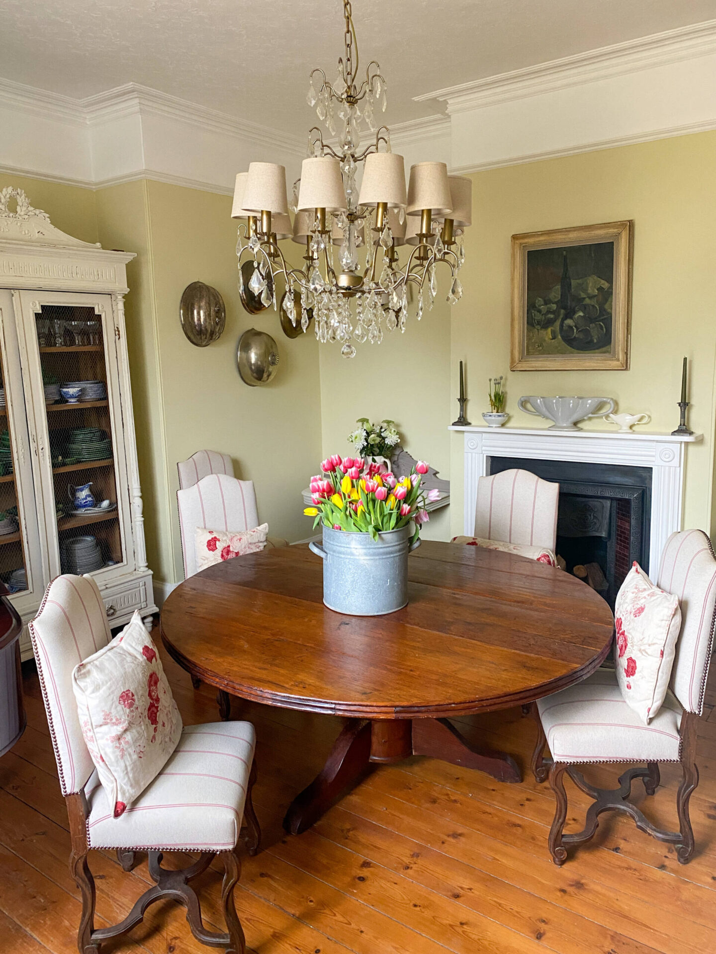
With my love of all things vintage, the furniture choices came easily and most of the house evolved slowly but surely. However, it was the colour of the dining room walls that became a sticking point. Unable to make a decision, yet equally as unable to live with the green walls, I was finally compelled to paint them in a quick and ‘temporary’ white undercoat with the intention of making a swift decision with the colour. However, several years later and with still no decision made on the colour, it began to torment me in its nondescript lack of conviction and direction.
Faced with the deep red damask equivalent in the drawing room, I had a few years earlier committed to a colour scheme that I had known and loved in both of our previous homes. That of Farrow and Ball French Grey and Bone. It was a tried and tested scheme for us that we had lived with and loved for many years, and although I had tried to resist the temptation to return to it at first in favour of something new, I had finally succumbed, safe in the knowledge that it had brought me great joy before and would therefore undoubtedly have the same effect again – and I wasn’t wrong. From the moment the distinctive colour went on the walls, I knew that it had been the right decision, and the room still causes a jolt of pleasure whenever I enter it to this day.
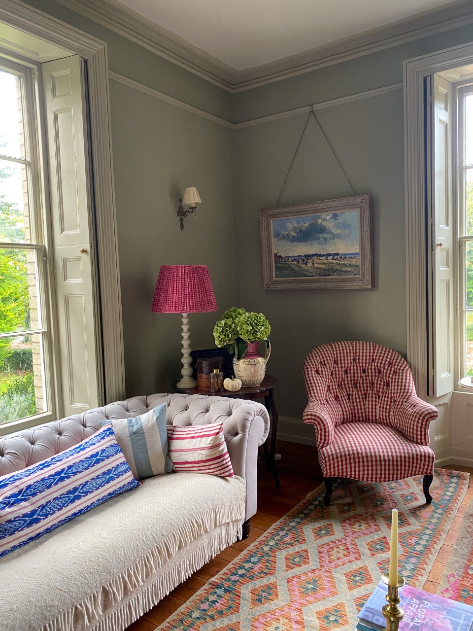
My much loved French Grey and Bone combination. Both colours from Farrow & Ball.
I longed for the same jolt of happiness upon entering the dining room, but I didn’t want to simply emulate the same colour palette. I wanted something to compliment the drawing room, but that was different enough to have a character of its on.
After far too long deliberating, I admitted defeat and acknowledged that perhaps for the first time I would need to seek the guidance of professionals. Someone who could perhaps give me the little jolt I needed to become a bit more adventurous and explore a colour spectrum beyond the safe greens that I was used to.
I had met Kat from Farrow and Ball at a press trip two years earlier, and it was she who suggested that I take advantage of the new Virtual Colour Consultation service via zoom with Farrow and Ball Brand Ambassador and colour consultant, Patrick O’Donnell.
We settled on a time and date, and I filled out a simple questionnaire in advance so that Patrick could get a good idea about the layout of the room, it’s light sources and aspect, as well as to find out my tentative thoughts on colour and style and most importantly – its use.
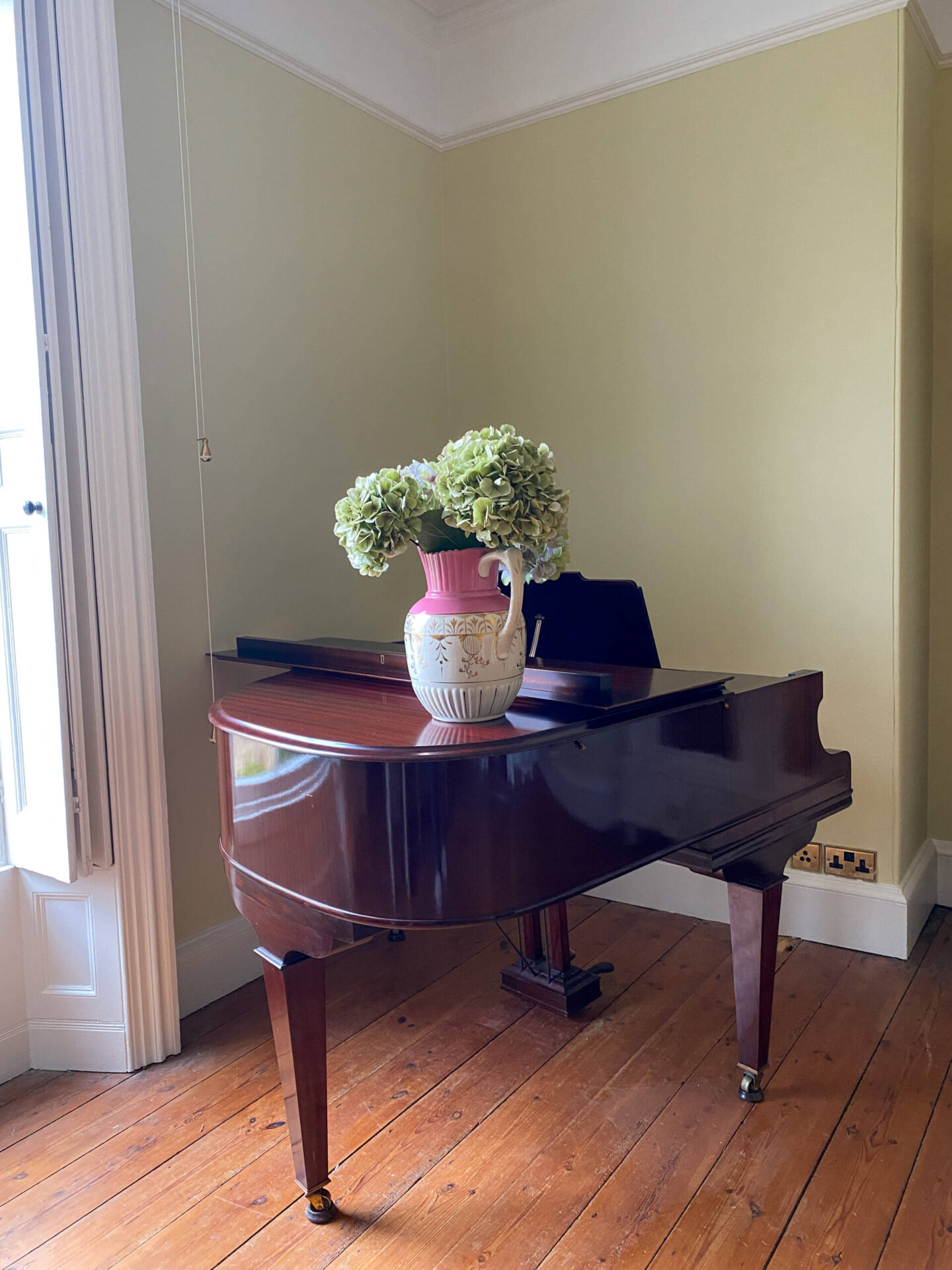
I knew that I was influenced by the traditional country house style of the early twentieth century, where colours were bold, yet comfortable and lived in. I had often contemplated the idea of a bright yellow, however, up until that moment, I hadn’t been brave enough.
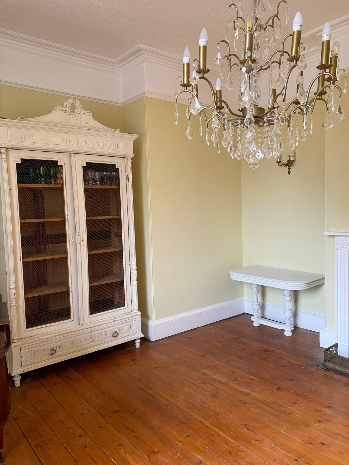
During the consultation, Patrick was as enthusiastic and knowledgeable as I’d hope he would be. He talked about the historical significance of certain colours and understood my desire for a bold change that would remain in keeping with the age of the house.
He agreed that a yellow would be an elegant choice of colour, but that perhaps a paler yellow than egg yolk would be more in keeping with the muted tones of the French grey and bone that featured in the sitting room.
After a thoroughly enjoyable discussion that also encompassed ideas for the front door and exterior of the house as well as the entrance hall, we said our virtual goodbyes, and I waited to receive Patricks’ write up of our chat, together with a list of recommendations.
Then we waited for the tester pots to arrive.
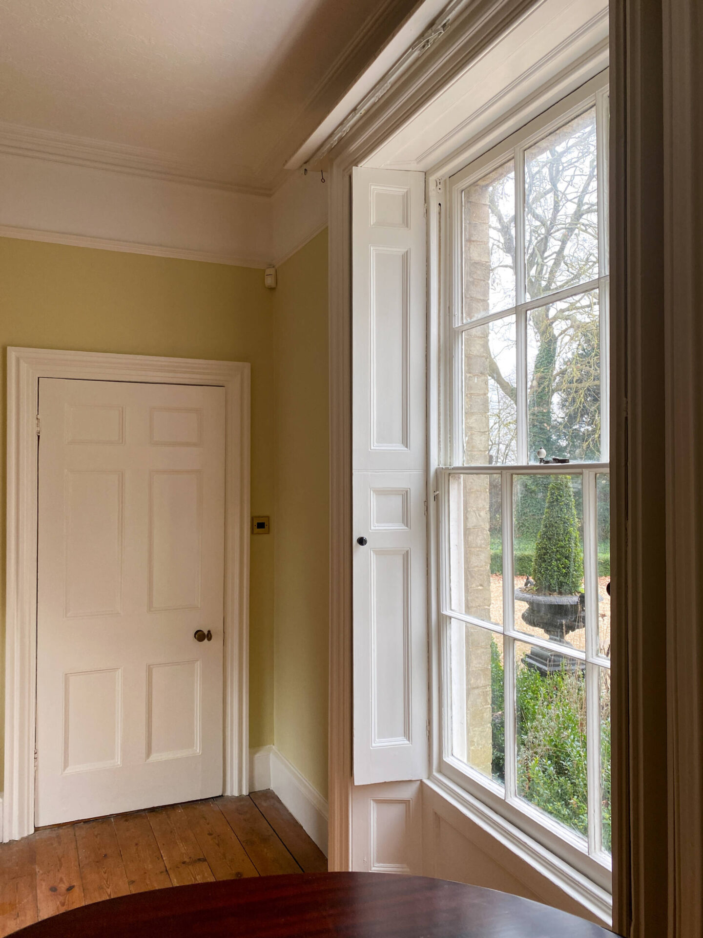
What we realised quickly is that he light in a room can change the tone of a colour in the most dramatic fashion. Warm sunshine can warm the tone, and a North facing room with its subdued light or no light at all, can drain certain colours of warmth but bring out an unexpected and cooler toned elegance. The tones change throughout the day, and it was incredibly important to see how different the same colour looked at different times of day.
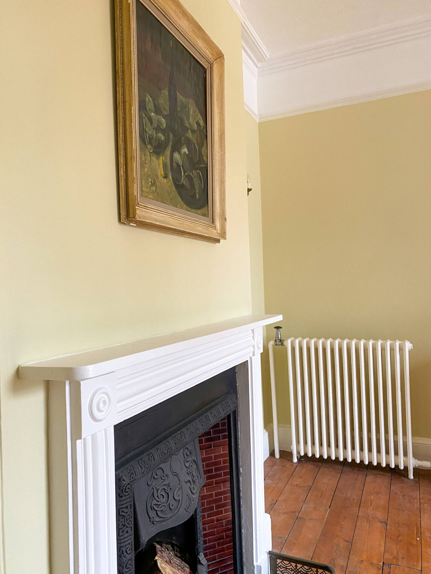
We decided on ‘Pale Hound’, a muted yellow which became an elegant pastel, with a slight citrus green zing to it in darker light which I loved, but during the daylight and against the white woodwork and ceiling, it stood out beautifully, appearing more yellow. It was the perfect balance.
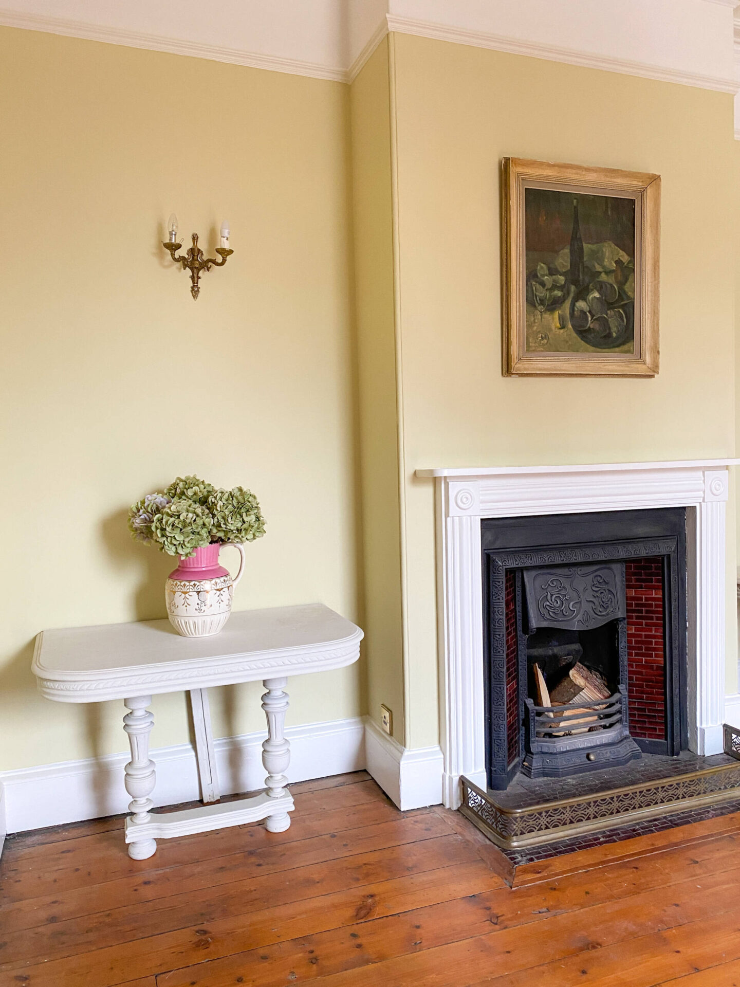
The Farrow and Ball Virtual Colour Consultancy is definitely worth a try if you’re feeling overwhelmed by endless possibilities and colour choices, or if you’re looking for the confidence to try out something new.
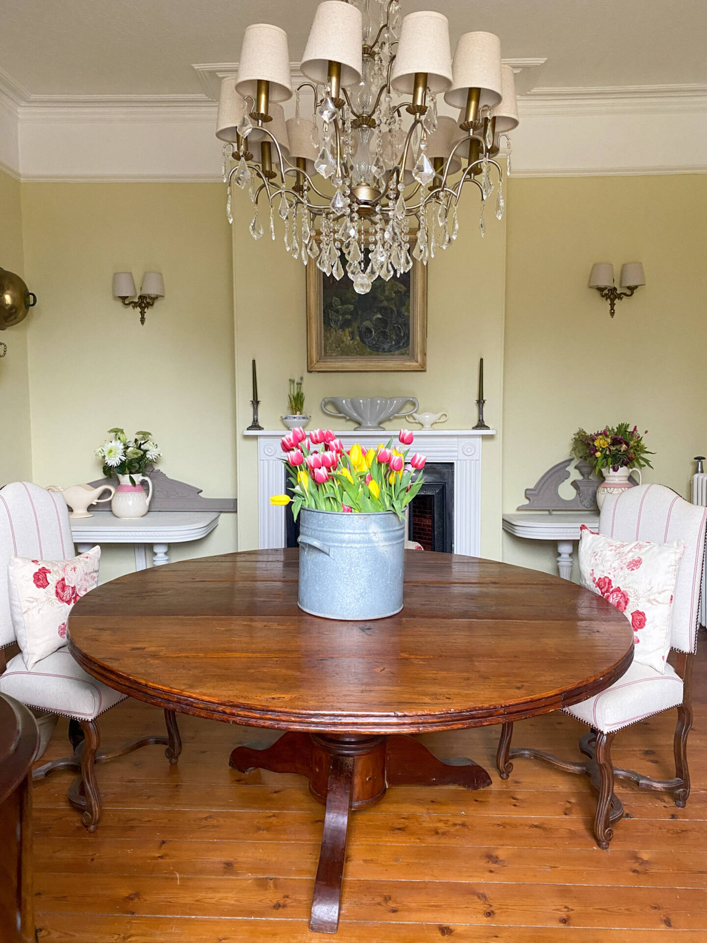
There are times when a helping hand is required to help take away the stress of too much choice and bring your vision for your home to life, and I for one have been delighted at finally being able to make a decision with ‘Pale Hound’ – even if it took me a few years!!
Until Next Time!

To go to the Farrow & Ball Website click HERE.
To go directly to the Farrow & Ball Virtual Colour Consultancy page click HERE.
Affiliate links have been used.
