I’m not one to necessarily follow the new trendy colours of the year, I know what I like and I like what I know. However, when a brand such as Farrow & Ball decided to bring out a range of new colours – something that they only do once every a few years, then I tend to sit up and take note.
| The New Farrow and Ball Colour Range |
You see, I’ve been using Farrow & Ball paint colours for over twenty years – ever since buying my first apartment with my husband.
We have subsequently used them in every home that we’ve owned.
It helps, that every home that I have lived in has been a period property, and the range of Farrow & Ball colours, particularly those with their flat finish are particularly – although by no means exclusively – suited to period properties. In fact many of them are based on heritage and existing colours from certain periods in history – and as a history buff, it makes perfect sense to me to use paint from a company that uses titles such as ‘Card Room Green’, ‘Manor house Grey’ and ‘Dead Salmon’!
Not so long ago I had the privilege of visiting the Farrow & Ball factory down in Dorset. It’s where all of the magic happens, and is an incredibly close knit and hands on operation considering that the paints are highly respected internationally and distributed world wide. The Farrow & Ball team pride themselves on working to small, highly controlled batches made to small orders, so that each colour mismatched to perfection. Of course the formula to the exquisitely chalky, yet rich depth to the finish that I love the most – is a highly treasured and well kept secret, and with good reason, as I’ve never seen a rival to it yet.
 |
| My Fellow Bloggers (L-R Nat, Me, Kat, Cara, Reena, Sally, Anna) and I posing at supper on The Farrow and Ball Trip with our lovely host Kat. |
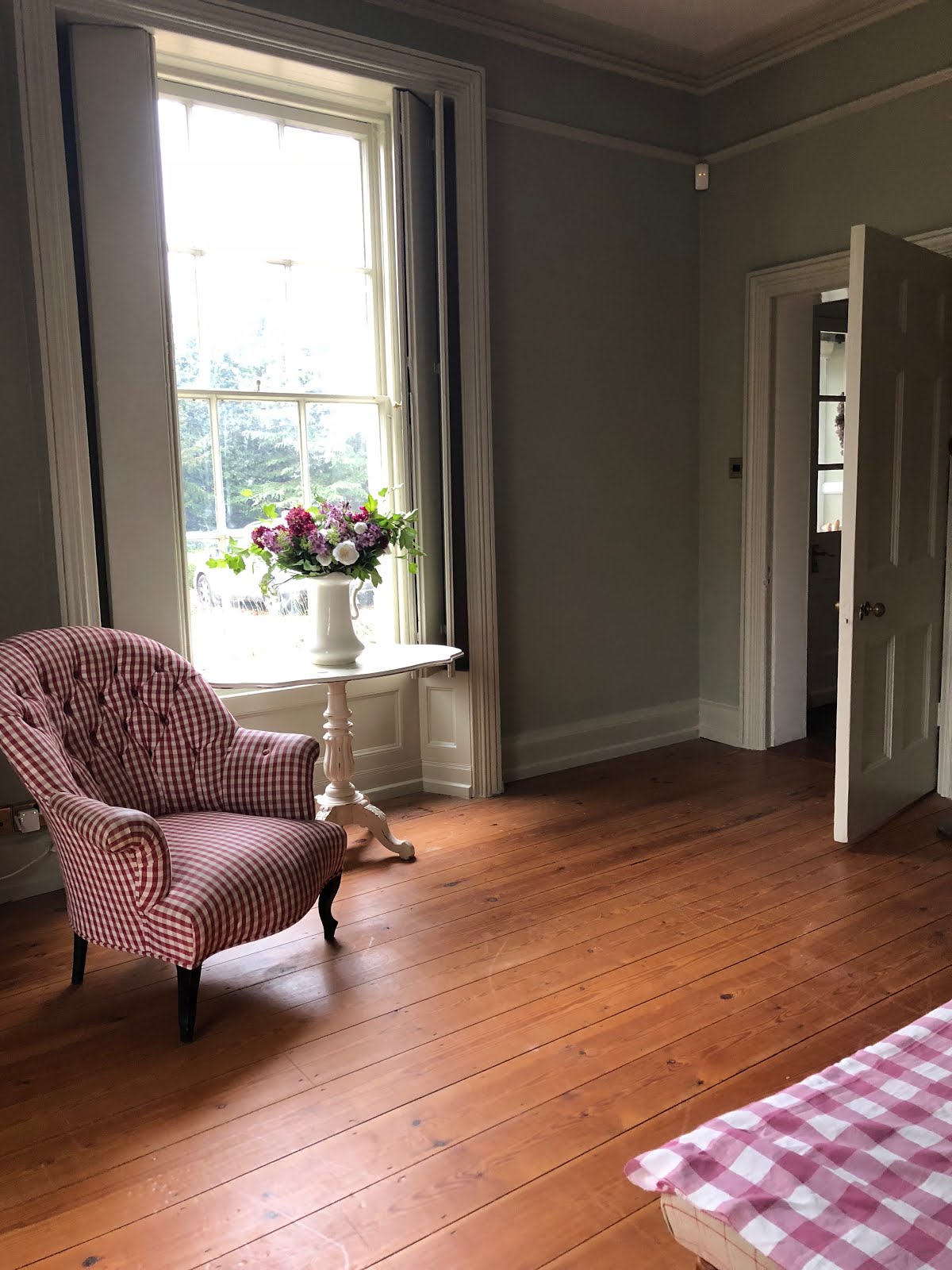
I recently made quite a dramatic change to the room that we call our Drawing Room at Hill House. After years of a rich, deep red wallpaper, I decided to return to a tried and tested old favourite combination of mine, naturally from Farrow & Ball – French Grey on the walls and Bone on the woodwork. I’d used this palette previously in that first flat and then again in our old London house before we moved to Norfolk – yes – I am a creature of habit, but I also feel that when something works beautifully and makes you feel happy, why not surround yourself with it! After enjoying the cocooning, Victorian study style deep red for so long, the light and fresh feel of these lighter more muted colours was an exciting and uplifting change. However, rather than use one of my familiar colours for the ceiling, where I tend to go lighter, I decided to try out one of the colours from the new selection at Farrow & Ball. Namely, School House White. I already new that I was in love with this chalky white, reminiscent of school chalk, because I had already painted two dining room side tables in this gloriously fresh colour, to highly pleasing effect.
 |
| The New colour scheme in painting progress! |
 |
| Second coat on! |
 |
| All done! Now to put things back! |

I think that the combination of this trio of colours has been a wonderful success, and the fact that I was safe in the knowledge that my existing furniture would work perfectly against the new palette (I’ve had several pieces – including the red check chair – for many, many years), made it an especially enjoyable experience.

However, I did love the deep red, richness of the previous red, and so when Farrow & Ball asked me whether I’d like to take part in a fun project based on the new colour launch, I jumped at the chance of using their “Preference Red” in honour of the dark richness of the ‘old’ style drawing room.
The brief was to take one or more of the new seasons colours and give an interpretation of them in my own distinctive way.
Well, as a known lover of old houses and period architecture, and the fact that Hill House, built in the Georgian era itself is often compared to a Dolls House due to it’s classic, perfectly symmetrical proportions, I decided that a Georgian Style dolls house painted in Preference Red with furniture painted in School House White, would be a fun and perfectly fitting interpretation for me.

The resulting images make me think of childhood Christmas’s past and present. There is an air of nostalgia about a traditional wooden dolls house, and the creamy chalkiness of School House White against the deep richness of the Preference Red really shows off the depth of colour in the Farrow and Ball finish to great effect. It was a wonderful project tom take part in, and the joy that I and the – admittedly teenage – children have taken from revisiting our younger years and playing with the dolls house in front of the Christmas tree has made the experience all the more festive and pleasurable.

In fact, now that the tree has been taken down, right here, playing in front of the fire is where I think I may stay for the foreseeable future!

Until next Time!

(This is not a sponsored post, but some of the paint was gifted. All views are my own.)

